# Load the necessary libraries
box::use(
  plotly[...],
  crosstalk[...],
  dplyr[...],
  lubridate[ym, year, month],
  purrr[accumulate],
  leaflet[...],
  janitor[clean_names],
  tidyr[...],
  stringr[...],
  forcats[...],
  ggplot2[...],
  ggtext[...],
  gt[...],
  gtExtras[...]
)

# Source the functions
box::use(modules/calc)
box::use(modules/plot)Motivation
I’m launching a new YouTube channel and a blog, and I’m eager to share my extensive experience in data science using R. My primary goals are to:
a) Support Aspiring Data Professionals: I aim to assist aspiring data scientists and analysts by providing valuable insights, tutorials, and practical examples using the powerful R and Python programming languages.
b) Showcase Data Science Expertise: Through this project, I intend to showcase my expertise in managing data science projects, demonstrating the entire process from conception to completion.
I’ve been actively using R in healthcare analytics since May 2018, and I’m excited to bring my knowledge to a broader audience through this new platform.
Introduction
Welcome to my journey through data science in R, from concept to completion! As I embark on launching a new YouTube channel and blog, I’m excited to share my extensive experience in data science using R. This platform provides an excellent opportunity to showcase my data science expertise and support and empower aspiring data scientists and analysts.
In this article, we will use Calgary crime data obtained from the Calgary Crime Data website for this project (Chol Aruai & I analyzed and wrote an article about this data in July 2022, using pandas). Here, you’ll find valuable insights, tutorials, and real-world examples, guiding you through the intricacies of data science with the R programming language. Whether you’re an aspiring data enthusiast or a seasoned analyst looking to enhance your skills, our content will provide the tools and knowledge needed to tackle data science projects effectively.
Join us as we explore the art and science of data and learn how to confidently manage data science projects. Together, we’ll uncover the endless possibilities that the world of data science in R offers.
Data Cleaning and Transformation
Loading the Required Libraries
We will utilize several essential R packages for this project, including dplyr, lubridate, purrr, tidyr, stringr, forcats, Plotly R, Crosstalk, leaflet, janitor, ggtext, gt, and gtExtras. Moreover, we will use the box package to manage our functions.
Importing Dataset
In this section, we will read in a CSV file named “Community_Crime_Statistics.csv” using the vroom package (you can also use readr to accomplish the same task) and then perform several data processing steps:
Clean the column names to make them more consistent and user-friendly using the
clean_names()function from thejanitorpackage.Select specific columns from the dataset, specifically those from “sector” to “date” and “community_center_point.” This saves time as it eliminates the need to specify each column individually.
Further, we process the data by transforming the “category” column:
- Convert the text in the “category” column to sentence case (e.g., from “Break & Enter - Commercial” to “Break & enter - commercial”).
- Categorize specific values in the “category” column as “Violence” if they meet the condition of containing “non-domestic,” leaving other values unchanged.
- Convert the “sector” and “community_name” columns to the title case (e.g., from “NORTHWEST” to “Northwest”).
Tip
Overall, we prepare and clean the data in the “calgary_raw” dataset for further analysis and visualization by renaming columns and transforming values in the “category,” “sector,” and “community_name” columns.
# Load the dataset
calgary_raw <- vroom::vroom(
  "Community_Crime_Statistics.csv",
  show_col_types = FALSE
) |>
  # Clean column names
  clean_names() |>
  # Select desired columns: we use intervals by column names
  select(sector:date, community_center_point) |>
  mutate(
    category = str_to_sentence(category),
    category = case_when(
      str_detect(category, "non-domestic") ~ "Violence",
      .default = category
    ),
    sector = str_to_title(sector),
    community_name = str_to_title(community_name)
  )
Data Summary and Exploration
In this section, I will perform a quick data summary and exploration by piping the “calgary_raw” dataset into the skim() function from the skimr package. The skimr package lets us quickly summarize the dataset to gain insights into its structure, data types, missing values, and statistical summaries of numeric columns.
The skim() function creates a data summary report that includes information such as the number of observations, the number of variables (columns), the data type of each variable, the number of missing values, and various summary statistics for numeric variables, including mean, median, standard deviation, and more.
This summary is useful for initial data exploration, as it helps us to quickly understand the characteristics and quality of the dataset, identify potential issues or outliers, and determine the next steps for data analysis or cleaning. It’s a helpful tool in the early stages of data analysis to get an overview of the data’s structure and contents.
calgary_raw |>
skimr::skim()| Name | calgary_raw |
| Number of rows | 79982 |
| Number of columns | 6 |
| _______________________ | |
| Column type frequency: | |
| character | 5 |
| numeric | 1 |
| ________________________ | |
| Group variables | None |
Variable type: character
| skim_variable | n_missing | complete_rate | min | max | empty | n_unique | whitespace |
|---|---|---|---|---|---|---|---|
| sector | 181 | 1 | 4 | 9 | 0 | 8 | 0 |
| community_name | 0 | 1 | 3 | 29 | 0 | 316 | 0 |
| category | 0 | 1 | 8 | 30 | 0 | 8 | 0 |
| date | 0 | 1 | 7 | 7 | 0 | 80 | 0 |
| community_center_point | 181 | 1 | 29 | 46 | 0 | 1024 | 0 |
Variable type: numeric
| skim_variable | n_missing | complete_rate | mean | sd | p0 | p25 | p50 | p75 | p100 | hist |
|---|---|---|---|---|---|---|---|---|---|---|
| crime_count | 1 | 1 | 2.83 | 3.62 | 1 | 1 | 2 | 3 | 110 | ▇▁▁▁▁ |
Group By and Summarization
In this section, our primary focus is on creating a refined dataset named “calgary_tbl” from the original “calgary_raw” dataset. To accomplish this, we implement several key data processing steps.
Column Splitting: We begin by splitting the “community_center_point” column into three separate columns: “NA,” “lon,” and “lat.” This transformation is achieved using the “separate_wider_delim()” function, which automatically drops specified columns marked as “NA.” This function is a more robust alternative to the traditional “separate()” function in the
tidyrpackage. Any rows with excessive values are automatically excluded during this process by setting “too_many” to “drop.”Identifying Non-Standard Community Names: We identify non-standard community names by applying a regular expression check to determine if the “community_name” begins with a non-digit character, such as special characters or letters. These rows are labeled as “wanted_rows” because they represent the correct community names. In essence, we filter out all non-standard community names.
Date Standardization and Cleaning: We proceed by converting the “date” column into a standardized date format and extracting the year from it. We then combine the year with the month to create a new “date” column in the “YYYY-MMM” format. Additionally, we remove any parentheses from the “lon” and “lat” columns to cleanse the data of unwanted characters.
Data Quality Assurance: To ensure data quality, we filter the dataset by removing rows with missing values in the “sector” column and rows featuring non-standard community names that lack a numeric starting character, as described earlier.
Grouping and Summarization: We group the data by “sector,” “category,” “year,” “date,” “lon,” and “lat.” Importantly, we include “lon” and “lat” in the “.by()” function to obtain distinct longitude and latitude values for each sector and community name. Subsequently, we calculate the sum of “crime” for each group and exclude missing values when applicable.
Dataset Review: Finally, we review the refined dataset, “calgary_tbl,” by inspecting the top 5 rows using the “slice_head()” function and present the output in a well-organized table format using “knitr::kable()”.
It’s worth noting that we’ve replaced “separate()” with “separate_wider_position()” and “separate_wider_delim()” due to their enhanced clarity, improved API, and superior handling of potential issues.
Tip
This code streamlines and enhances the “calgary_raw” dataset by addressing missing values, adjusting data types, and aggregating crime counts. Furthermore, it ensures data quality and provides a convenient means of inspecting the refined dataset.
Overall, the provided details offer a comprehensive view of the data preparation steps and their significance in the analysis.
# Subset the data
calgary_tbl <-
  calgary_raw |>
  separate_wider_delim(
    community_center_point,
    delim = " ",
    names = c(NA, "lon", "lat"),
    too_many = "drop"
  ) |>
  # Identify non-standard community names
  mutate(
    wanted_rows = str_detect(community_name, "^\\D"),
    date = ym(date),
    year = year(date),
    date = str_c(year(date), "-", month(date, label = TRUE)),
    lon = str_remove_all(lon, "\\("),
    lat = str_remove_all(lat, "\\)")
  ) |>
  # Drop rows with nas: 181 rows; non-standard community names: 1026 rows
  filter(!is.na(sector), wanted_rows) |>
  # Group by and summarization
  calc$summarize_calgary_crime_data(
    crime_var = crime_count,
    group_var = c(sector:category, year, date, lon, lat)
  )

# Inspect the top
calgary_tbl |>
  slice_head(n = 5) |>
knitr::kable()| sector | community_name | category | year | date | lon | lat | crime |
|---|---|---|---|---|---|---|---|
| Northeast | Abbeydale | Violence | 2022 | 2022-Apr | -113.927803856151 | 51.059415006964 | 1 |
| Northeast | Abbeydale | Break & enter - commercial | 2022 | 2022-Apr | -113.927803856151 | 51.059415006964 | 2 |
| Northeast | Abbeydale | Break & enter - other premises | 2022 | 2022-Apr | -113.927803856151 | 51.059415006964 | 1 |
| Northeast | Abbeydale | Theft from vehicle | 2022 | 2022-Apr | -113.927803856151 | 51.059415006964 | 5 |
| Northeast | Abbeydale | Theft of vehicle | 2022 | 2022-Apr | -113.927803856151 | 51.059415006964 | 4 |
Visualizing Calgary Crime Data with ggplot2 Package
With our dataset now cleaned and transformed, we embark on exploratory data analysis (EDA) using the ggplot2 and ggtext packages. Our first step is to create a data plot based on the year, defining color aesthetics using the Sector column.
Here, we assign a label (“fig-ggplot_1”) to distinguish our plot from subsequent plots and provide a caption for the figure titled “Calgary Crime Activities by Sector & Year.” Subsequently, we process and summarize crime data in Calgary to obtain crime counts by Sector and Year, naming this resulting dataset “sector_crime.” Then, we generate a plot with the crime count on the x-axis and the year on the y-axis, with the years presented in reverse order.
A brief analysis of our plot reveals that the “Centre Sector” consistently reports the highest number of crime activities each year.
# Crime count by sector
sector_crime <-
  calgary_tbl |>
  calc$summarize_calgary_crime_data(
    crime_var = crime,
    group_vars = c(sector, year)
  )

# Plot crime count by year
sector_crime_g <-
  sector_crime |>
  plot$plot_calgary_crime_data(
    x_var = crime,
    y_var = year |> factor() |> fct_rev(),
    max_var = 15000,
    step_var = 5000,
    fill_var = sector,
    x = "Crime Count",
    y = NULL,
    fill_text = "Sector",
    title = "Centre Sector leads all the Sectors in Number of Crime Activities."
  )

#Print the plot
sector_crime_g
In this section, we summarize the dataset by Sector and Crime category and then plot it with the Category on the y-axis and the crime count on the x-axis for better visualization. Once again, we observe that the Centre Sector leads in all categories of crime activities, except for ‘Theft of Vehicle.’
# Crime count by sector & category
category <- calgary_tbl |>
  mutate(category = str_wrap(category, width = 15)) |>
  calc$summarize_calgary_crime_data(
    crime_var = crime,
    group_vars = c(sector, category)
  )

# Plot Crime activties by sector & category
cat_g <-
  category |>
  plot$plot_calgary_crime_data(
    x_var = crime,
    y_var = category,
    max_var = 30000,
    step_var = 5000,
    fill_var = sector,
    x = "Crime Count",
    y = NULL,
    fill = "Sector",
    title = "The Centre Sector leads in all categories of crime activities except for 'Theft of Vehicle'."
  )

# Display the plot
cat_g
Tabulating Calgary Crime Activities by Sector and Category
In this section, we organize the dataset obtained in the previous section and create a table using the gt and gtExtras packages. Our previous findings remain consistent – except for ‘Theft of Vehicle,’ the Centre Sector continues to exhibit the highest counts of crime activities.
Tip
It’s worth noting that we used the relocate() function from the dplyr package to reorder columns. We used relocate() to demonstrate its functionality, but achieving the same task using the select() function is also possible.
# Tabulate the data
# -----------------
table_obj <-
  category |>
  pivot_wider(
    names_from = category,
    values_from = crime
  ) |>
  clean_names() |>
  relocate(
    c(commercial_robbery),
    .after = 3
  ) |>
  relocate(
    break_enter_dwelling,
    .after = break_enter_other_premises
  ) |>
  relocate(
    street_robbery,
    .after = commercial_robbery
  ) |>
  relocate(
    theft_of_vehicle,
    .after = theft_from_vehicle
  ) |>
  relocate(violence, .after = 1) |>
  arrange(desc(violence))


# Initialize the table
table_obj |>
  gt(rowname_col = "sector") |>
  cols_align(
    columns = where(is.numeric),
    align = "center"
  ) |>
  cols_align(
    columns = sector,
    align = "right"
  ) |>
  fmt_integer() |>
  cols_label(
    commercial_robbery = "Commercial",
    break_enter_commercial = "Commercial",
    break_enter_other_premises = "Premises",
    break_enter_dwelling = "Dwelling",
    theft_from_vehicle = "From Vehicle",
    theft_of_vehicle = "Of Vehicle",
    street_robbery = "Street"
  ) |>
  tab_spanner(
    label = "Non-Domestic",
    columns = 2
  ) |>
  tab_spanner(
    label = "Theft",
    columns = 3:4
  ) |>
  tab_spanner(
    label = "Robbery",
    columns = 5:6
  ) |>
  tab_spanner(
    label = "Break & Enter",
    columns = 7:9
  ) |>
  gt_theme_espn() |>
  tab_header(
    title = "The Centre Sector leads in all categories of crime activities except for 'Theft of Vehicle'."
  ) |>
  tab_footnote(
    footnote = md("Data obtained from: [Calgary Crime Data](https://data.calgary.ca/Health-and-Safety/Community-Crime-Statistics/78gh-n26t)")
)| The Centre Sector leads in all categories of crime activities except for 'Theft of Vehicle'. | ||||||||
| Non-Domestic | Theft | Robbery | Break & Enter | |||||
|---|---|---|---|---|---|---|---|---|
| violence | Commercial | Commercial | Street | Premises | Dwelling | From Vehicle | Of Vehicle | |
| Centre | 16,028 | 13,208 | 599 | 1,294 | 5,385 | 2,909 | 26,065 | 8,479 |
| Northeast | 8,412 | 3,925 | 497 | 1,054 | 2,177 | 1,830 | 14,991 | 9,812 |
| South | 5,165 | 2,928 | 267 | 316 | 1,725 | 1,964 | 11,162 | 3,916 |
| East | 3,979 | 2,252 | 210 | 447 | 1,090 | 800 | 5,722 | 3,992 |
| Northwest | 3,862 | 2,033 | 223 | 269 | 1,248 | 1,918 | 7,713 | 2,683 |
| North | 2,903 | 1,431 | 161 | 220 | 791 | 1,490 | 5,677 | 2,766 |
| West | 2,600 | 1,454 | 178 | 223 | 819 | 1,527 | 4,924 | 1,614 |
| Southeast | 2,446 | 1,738 | 94 | 107 | 518 | 1,082 | 4,887 | 2,301 |
| Data obtained from: Calgary Crime Data | ||||||||
Visualizing Calgary Crime Activities with the leaflet Package
In this section, we leverage the leaflet package to visually represent crime activities within Calgary’s communities. This marks my inaugural use of this package, and I extend my gratitude to DataCamp.com for their invaluable courses.
Our initial step involves creating a data frame named map_data by summarizing the calgary_tbl dataset, which has been a focal point in our previous sections. We group this data by sector and community name, subsequently calculating the total count of crimes. Additionally, we determine the mean longitude (lon) and latitude (lat) for each community. This meticulous approach guarantees that we possess unique longitude and latitude values for every community.
Following this data preparation, we introduce map_data into a leaflet canvas to initiate the map visualization process. We augment the canvas with a tile layer furnished by the “CartoDB” provider, although there exist various provider options catering to individual preferences.
Subsequently, we enhance our map’s customization by utilizing the clearMarkers() function to eliminate any previously added markers. To replace them, we introduce circular markers onto the map, configuring them with a radius of 5, an orange color scheme, and labels denoting the community name and the corresponding crime count enclosed in parentheses.
Our overarching goal in this section and the subsequent one is to offer a visually intuitive representation of the data, facilitating a better understanding of the distribution of crime activities across different areas.
map_data <-
  calgary_tbl |>
  group_by(sector, community_name) |>
  summarise(
    crime = sum(crime),
    lon = mean(as.numeric(lon)),
    lat = mean(as.numeric(lat))
  )

map_data |>
  leaflet() |>
  addProviderTiles("CartoDB") |>
  addMarkers(lng = ~lon, lat = ~lat) |>
  clearMarkers() |>
  addCircleMarkers(
    lng = ~lon,
    lat = ~lat,
    radius = 5,
    color = ~"#EA650D",
    label = ~ paste0(community_name, " (", crime, ")")
  )


Calgary Crime Activities by Community
# Wrap data frame in SharedData
community_data <-
  calgary_tbl |>
  mutate(
    year_month = date,
    date = ym(date)
  ) |>
  summarize(
    crime = sum(crime),
    lon = mean(as.numeric(lon)),
    lat = mean(as.numeric(lat)),
    .by = c(sector, year)
  )

crime_activities_by_sector <-
  community_data |>
  SharedData$new(key = ~sector)


# Use SharedData like a dataframe with Crosstalk-enabled widgets
leaflet(crime_activities_by_sector) |>
  addTiles() |>
  addMarkers(lng = ~lon, lat = ~lat)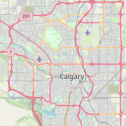


Crime Activities by Sector
Plotting a Line Graph with the Plotly R Package
In this section, we turn to one of the most potent tools in data science visualization, the Plotly R package, to visualize our Calgary crime dataset. We commence by subsetting data from the calgary_tbl dataset. To enhance data analysis, we transform the date column into a new one named “year_month” and convert the original date column into a year-month format using the ym() function from the lubridate package.
Subsequently, we employ our custom function, summarize_calgary_crime_data, to calculate the total crime counts, grouping the data by sector, date, and year_month. We assign the resulting dataset to the “community” data frame.
The next step involves creating a line graph using the Plotly R package to visually represent the crime trend in Calgary over time. We place the date on the x-axis and the crime count on the y-axis, with color indicating different sectors. Additionally, we implement a tooltip text displaying sector, date, and crime count. We set the axis breaks to intervals of three months using the “dtick” argument, along with other labeling adjustments in the layout.
The generated Plotly line graph visualizes crime activities in Calgary by sector and month, offering valuable insights into trends from January 1, 2017, to September 30, 2023.
Our analysis of crime activities by Sector and month reveals that the Centre and Northeast sectors exhibit higher trends in crime activities. Notably, all Calgary communities experienced fluctuation in crime activities throughout the past 6 plus years. Furthermore, the West Sector consistently maintains the lowest crime activities among all Calgary communities. Additionally, the Northwest overtook the East Sector in October 2021 and remained higher until April 2023.
# Subset the data
community <-
  calgary_tbl |>
  mutate(
    year_month = date,
    date = ym(date)
  ) |>
  calc$summarize_calgary_crime_data(
    crime_var = sum(crime),
    group_vars = c(sector, date, year_month)
  )

# Plot a line graph with plotly
plotly_g <-
  community |>
  plot_ly(
    x = ~date,
    y = ~crime,
    color = ~sector,
    hoverinfo = "text",
    text = ~ paste0(
      "Sector:", sector, "<br>",
      "Date:", year_month, "<br>",
      "Crime Count:", crime
    )
  ) |>
  add_lines(colors = "Dark2", name = ~sector) |>
  layout(
    xaxis = list(
      title = "",
      dtick = "M3",
      tickformat = "%Y<br>%b",
      width = 1000
    ),
    yaxis = list(title = "Crime Count"),
    title = "Calgary Crime Activities Fluctuate between January 1, 2017 to September 30, 2023"
  )

plotly_gVisualizing Calgary’s Crime Activities by Month and Category
In this section, we craft a dynamic plot to visualize crime activities in Calgary, categorized by both month and crime type. For improved representation, we classify crime incidents into broader categories, such as “Robbery,” “Theft,” “Break & Enter,” and “Violence,” using a case_when() statement based on the content of the “category” column.
Once the data is transformed, we calculate the total sum of crime incidents by grouping the data based on both the date and the new category, naming the resulting data frame “crime_cat.”
Next, we create an interactive plot using the Plotly R package. This plot illustrates the trend of crime activities in Calgary over time, organized by different crime types. The x-axis showcases the date, while the y-axis indicates the crime count. To provide additional information, we incorporate tooltips displaying details about the category, date, and crime count for each data point.
Our analysis of Calagry Crime Activities by Month & Category reveal that robbery activities, both commercial and street, have consistently remained at lower levels compared to other crime categories over the past 6.75 years. In contrast, theft (both from and of vehicles) has always maintained high levels. Furthermore, after a brief decline between October 2020 and February 2021, Calgary’s crime activities began to increase, but they appear to decline again toward the end of 2023. Additionally, non-domestic violence surpassed break & enter in January 2022 and has stayed above ever since.
Tip
The resulting dynamic plot, labeled “Calgary Crime Activities by Month & Category,” offers a visual representation of how crime activities in Calgary have evolved over time, categorized by specific crime types from January 1, 2017, to September 30, 2023. The graph enables viewers to explore and analyze crime trends within various categories throughout the specified time period.
# Create a dynamic plot
crime_cat <-
  calgary_tbl |>
  mutate(
    date = ym(date),
    category = case_when(
      str_detect(category, "robbery") ~ "Robbery",
      str_detect(category, "Theft") ~ "Theft",
      str_detect(category, "Break & enter") ~ "Break & Enter",
      TRUE ~ "Violence"
    )
  ) |>
  calc$summarize_calgary_crime_data(
    crime_var = sum(crime),
    group_vars = c(date, category)
  )

cat_g <- crime_cat |>
  plot_ly(
    x = ~date, y = ~crime,
    hoverinfo = "text",
    text = ~ paste0(
      "Category:", category, "<br>",
      "Date:", date, "<br>",
      "Crime Count:", crime
    )
  ) |>
  add_lines(color = ~category) |>
  layout(
    xaxis = list(
      title = "",
      dtick = "M3",
      tickformat = "%Y<br>%b",
      width = 1000
    ),
    yaxis = list(title = "Crime Count"),
    title = "Calgary Crime Trend (January 1, 2017 to August 31, 2023"
  )

cat_gHarnessing the Powers of Plotly R and Crosstalk Packages
In this section, we harness the capabilities of the Plotly R and Crosstalk packages to create dynamic visualizations of crime activities in Calgary. First, we group the crime dataset by sector, year, and category, calculate the sum of crime counts in each sector, and name the new data frame “sector_dynamic.”
Next, we create a shared data object, “shared_sector,” keyed by the sector, to facilitate synchronized interactions between multiple visualizations.
To plot interactive joint bar and scatter plots, we generate a bar chart, “bar_chart,” that displays the frequency of crime activities by sector. The sector is plotted on the x-axis, and the frequency of crime activities is shown on the y-axis. Additionally, we create a bubble chart, “bubble_chart,” to visualize the relationship between crime activities and years for each sector. This scatterplot uses bubbles to represent the data points and color-codes them by crime category. The x-axis represents the year, the y-axis represents the crime count, and tooltips provide information about the crime category. Finally, we remove the legend from both the bar chart and bubble chart to declutter the visualizations.
# Create a dynamic plot
sector_dynamic <-
  calgary_tbl |>
  calc$summarize_calgary_crime_data(
    crime_var = crime,
    group_vars = c(sector, year, category)
  )

# Create a shared data object keyed by sector
shared_sector <- sector_dynamic |>
  SharedData$new(key = ~sector)

# Create a sector bar chart
bar_chart <- shared_sector |>
  plot_ly() |>
  group_by(sector) |>
  summarize(crime = sum(crime)) |>
  # arrange(desc(crime)) |>
  add_bars(x = ~sector, y = ~crime) |>
  layout(
    barmode = "overlay",
    xaxis = list(title = "Sector"),
    yaxis = list(title = "Frequency of Crime Activities")
  )

# Create a sector bubble chart
bubble_chart <- shared_sector |>
  plot_ly(
    x = ~year,
    y = ~crime,
    hoverinfo = "text",
    text = ~category,
    color = ~category
  ) |>
  add_markers(marker = list(sizemode = "diameter")) |>
  hide_legend() |>
  layout(
    xaxis = list(title = ""),
    yaxis = list(title = "")
  )

# Remove the legend
bscols(bar_chart, bubble_chart) |>
hide_legend()Closing Remarks
In this comprehensive analysis of Calgary crime data, we embarked on a journey through the dynamic field of data science in R and Python. My motivation for launching a new YouTube channel and blog was driven by two primary goals:
a) Support Aspiring Data Professionals: I aim to empower and guide individuals aspiring to become proficient data scientists and analysts by providing valuable insights, tutorials, and practical examples using the powerful R and Python programming languages.
b) Showcase Data Science Expertise: Through this project, I intend to demonstrate my expertise in managing data science projects, sharing the entire process from concept to completion with our growing community.
We delved into the intricacies of data science, harnessing the capabilities of essential packages like tidyverse, Plotly R, Crosstalk, leaflet, janitor, ggtext, gt, and gtExtras. Our analysis involved data cleaning, transformation, and dynamic visualization, creating interactive charts to explore crime trends in Calgary over the years.
Key Findings:
In our analysis of crime activities by Sector and Month, we discovered that the Centre and Northeast sectors exhibited higher trends in crime activities. Notably, all Calgary communities experienced fluctuations in crime activities throughout the past 6-plus years, while the West Sector consistently maintained the lowest crime activities among all Calgary communities. Additionally, the Northwest overtook the East Sector in October 2021 and remained higher until April 2023.
Our examination of Calgary Crime Activities by Month and Category revealed intriguing trends. Robbery activities, both commercial and street, consistently remained at lower levels than other crime categories over the past 6.75 years. In contrast, theft (both from and of vehicles) always maintained high levels. Furthermore, after a brief decline between October 2020 and February 2021, Calgary’s crime activities began to increase, but they appear to be declining again toward the end of 2023. Additionally, non-domestic violence surpassed break & enter in January 2022 and has remained above ever since.
In conclusion, this project embodies my commitment to supporting aspiring data professionals and showcasing my data science expertise. Whether you are embarking on your data science journey or looking to enhance your skills, my content will equip you with the tools and knowledge needed to effectively tackle data science projects.
Together, we have unveiled the boundless possibilities the world of data science in R offers. I invite you to join me on this exhilarating journey through the art and science of data, where we can continue exploring the captivating realm of data science with unwavering confidence. To explore more in-depth tutorials and engage with our community, I invite you to follow my YouTube channel (@AlierwaiDataStudio) and blog (www.alierwai.org), where our data science adventure continues.